The colour block component, whose option icon is shown below, creates a coloured area with options inside it.

Colour blocks may have any combination of background colours, border colours, and rounded corners:

Editing a colour block
Inside each colour block component are colour block bars, as shown below. The plus sign on the lower bar lets you add options.

Click on the colour block bar to open the colour block window:
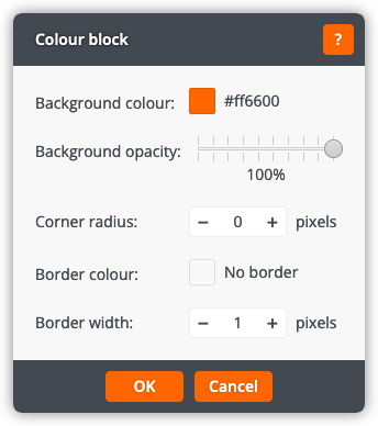
The colour block window lets you change the following settings:
Background colour
The colour for the background of the colour block.
Background opacity
The opacity of the colour block: a lower opacity (more transparency) will allow more of the website background to show through, while a higher opacity (less transparency) will show more of the colour block background colour.
Corner radius
The radius of the corners, in pixels. A value of 0 creates square corners.
Border colour
The colour for the border of the colour block.
Border width
The width of the border, in pixels. A value of 0 will remove the border.
Click OK to apply the changes to the colour block. Click Cancel to return to the page without changing the colour block.
